

This time we stayed down in Wall Street, or FiDi in broker-speak, an area I have generally shunned but have begun to favor for its convenience. Most of the major subway lines flow into Fulton Street station, and you can be in the Upper East Side or West Side in 30 minutes or less. There are a few early brick buildings at the southern tip, creating an especially charming strip of pubs along Stone Street.

All around are towers of varying heights. Several office buildings, both prewar and postwar, have been converted into apartment buildings. Everybody thinks it’s strange to live down there, but it is relatively quiet.
We saw several improvements to the waterfront between South Street Seaport and Battery Park. The waterfront design by SHoP Architects and landscape architecture by Ken Smith features wood chaises inspired by the High Line and some great barstools overlooking the water. South Street Seaport still exists for tourists, but just north of there, the chain shops peter out immediately and there is a little old funk left. It is a place with the wind gone from its sails. (Read Alexandra Lange’s great assessment at http://observatory.designobserver.com/entry.html?entry=7927) Apparently, SHoP has big plans for mally bits at the end of the pier. (http://blog.archpaper.com/wordpress/archives/34183)
.JPG)
 |
| Pier 17 courtesy SHoP Architects |
Designwise, the big news is NewYorkbyGehry, also known as 8 Spruce Street. From a distance, the metal elevations look like a lake’s rippled surface turned on its side. They should call the building the Ripple, except for the connotation with the beverage once consumed by winos on the Bowery. The south elevation is flat and as dull as any high-rise. What the photographs on the web don’t show is the base of the shimmering tower, which is mostly occupied by a public school and epitomizes banality.

The Party
ArchNewsNow has delivered international news about architecture and related topics for ten years, and that warranted a party at the Center for Architecture, everybody’s favorite nonclub subbasement space. Founder Kristen Richards and her husband George Yates have built a tool used by thousands of editors and architects every day. Kristen always wears red, but had a special pair of shoes for the occasion.

The architectural media world turned out to congratulate her, including Paul Goldberger, now of Vanity Fair, James Russell, Bloomberg’s architecture contributor, regular New York Times contributor Fred Bernstein, Architect’s Newspaper editor Bill Menking and publisher Diana Darling, Remodelista.com editor Lydia Lee, Alexandra Polier from Dwell, Contract editor in chief John Czarnecki, and two of his predecessors, Jennifer Busch and Roger Yee. There seemed to be a large contingent from San Francisco, including my buddies Yosh Asato and George Calys.
 |
| Kristen Richards with George Yates and Paul Goldberger |
 |
| Mark Murishage, Paul Crabtree (obscured) and Diana Darling |
 |
| Fred Bernstein |
 |
| Kristen Richards |
 |
| Jennifer Busch |
 |
| John Czarnecki and Lydia Lee |
 |
| David Ling and Bill Menking |
In addition to having nibblies, the event featured a special drink made of hibiscus juice that was named the Newsplash by fellow publicist Tami Hausman. Of course the party went longer than the prescribed time, and we got thrown out. Just as we were leaving, we noticed all kinds of sirens from ambulances and fire trucks. No wonder Kristen likes red so much.
The Restaurant Report
Il Mulino could be your grandmother’s house in Queens. Décor is not its strong suit. But they bring you a series of antipasti as soon as you sit down, and they are not an afterthought. It’s old fashioned but with care.
We dined at another tried and true spot, Esca, which is more contemporary Italian but focused on fish. I tried sea urchin for the first time. The crudo was incredibly fresh, and this spot remains one of the best restaurants near the New York Times, which must have the best-looking cafeteria after Condé Nast’s. Piano just gets all the lines in the right places.
 |
| Urchins at Esca |

We were back in Brooklyn again to see the glowing Sofia Zimmerman and ended up at James, where the drinks are especially good. It’s a good neighborhood kind of place.
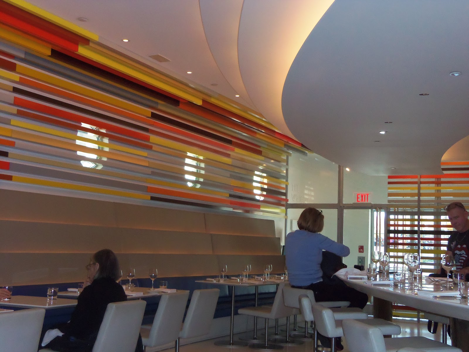
On the weekend, we tried Wright for the first time. Decent chow but not inspired. However, if you are at the Guggenheim and want a bite, it’s reasonably priced, and the new décor by Andre Kikoski feels both current and respectful of the Wright’s monument.
Just when you thought that Spanish tapas had run its course, Luis Bollo, one of NY’s celebrity chefs, opens a new place called Salinas. Where we live, Salinas is a hardscrabble farming town that John Steinbeck wrote about. But not so in Spain. We went completely overboard with the tapas ordering, and could have passed on the main courses. But the suckling pig is the standout. Enough for two. The paella wasn’t sticky enough on the bottom for me, but neither was it dried out. The desserts, although not exactly Spanish, were sensational. They have reworked what used to be a Thai restaurant, and while the hallway between the bar in the front and the dining rooms in the rear is dreadful, the roof over the rear dining room opens, which was great for a little fresh spring air. But bring your flashlight app to read the menu!
And if you are on the Upper West Side and looking for modest Indian food, we liked Aangan, especially the tandoori lamb chops.
No time for retail therapy this trip, but we do mourn the closing of SoHo’s best shop, Moss. Now a legend in design circles, Murray Moss made shopping a joyful education. Architects from San Francisco were always amazed by the diversity of his vision.
 |
| Murray Moss courtesy www.metropolismag.com |
Art Flash
Our museum time was also limited this trip, so we took in the famous Whitney Biennial and the John Chamberlain retrospective. My mistake at the Whitney was to start on the fifth floor, where I was seduced by a suite of 12 Agnes Martin canvases from 1979 entitled “The Islands.” White with hints of green and blue and graphite lines. Martin, like Rothko, asks the viewer to stop. Really stop and just pay attention. I thought, how will an artist like this be appreciated in a technological age? She is just the painter we need now, but what happens when young curators and viewers hopped up on so much video and techno wizardry are confronted with what appears at first to be so little? This may be the challenge of contemporary Biennials. Little of the material kept my attention. Two pieces stood out. The collaboration between Gisèle Vienne, Dennis Cooper, Stephen O’Malley, and Peter Rehberg entitled “LAST SPRING: A Prequel” was wonderfully creepy. An androgynous teenager expresses his madness with a puppet. Apparently this is a slice of larger work in progress. I have never been able to get through a Dennis Cooper novel. Too dark. But I found him sympathetic in a recent interview in the Paris Review. Maybe some of his cruelty gets softened when he collaborates with visual artists.

I am old fashioned in some ways (and was accused this week of being part of a neocon publication!). I confess that I am often looking for beauty. I was drawn to Luther Price’s slide shows, which were retro in their use of projected images and automated carousel slide projectors. (Who will fix them in the future? The typewriter repairman?) He is like a Joseph Cornell of the slides. Found stuff, even ugly stuff, turned into beauty. (http://whitney.org/Exhibitions/2012Biennial/LutherPrice).
John Chamberlain fills the Guggenheim with beauty. Mostly beauty from scrap metal that once constituted an automobile. He doesn’t assault you, unless you fall on one of the sharp rusted edges of his sculptures. I have a soft spot for the Guggenheim because my first visit, in the summer of 1967, transformed my experience of architecture. But as I have noted before, it is not a good place to show art. The David Smith and Louise Bourgeois shows in recent years were two notable exceptions. The installation of a range of the artists’ work along the ramp and the walls once again fulfills the promise of the building’s architecture.

If you begin at the top and work your way down, the building seems to turn with you. The problem with this strategy is that it means you begin at the end of a retrospective and work backwards. However, this is just fine with Chamberlain’s work. You see how he had two high points in his career. The beginning and the end. Towards the end, he was using fewer colors and making bold calligraphic statements with his scraps. One of his triumphs was to take something so central to America’s success and power and render it as light as torn strips of paper. Chamberlain himself talked about “fit.” His pieces were a logical step from Pollock. It takes more time to bend and weld car parts than to hurl paint. But at the end of the day, he created a graceful order instead of rusted chaos.
The Guggenheim’s website has a lot of info. (http://web.guggenheim.org/exhibitions/chamberlain/#)
The show is up through May 13.
 |
| John Chamberlain Untitled, ca. 1961 courtesy www.web.guggenheim.org |

